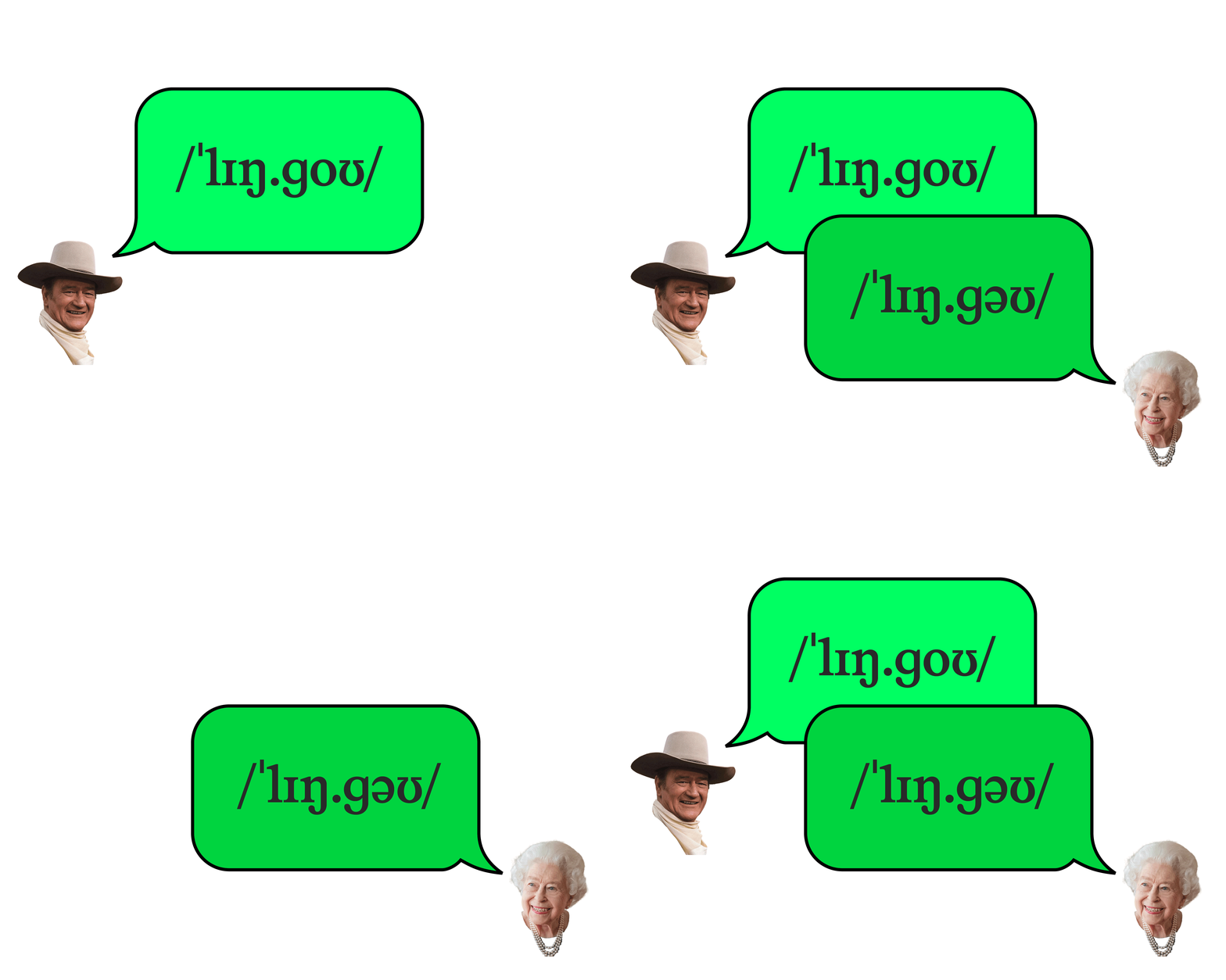
Shhh… quiet please. Lingo’s out now!
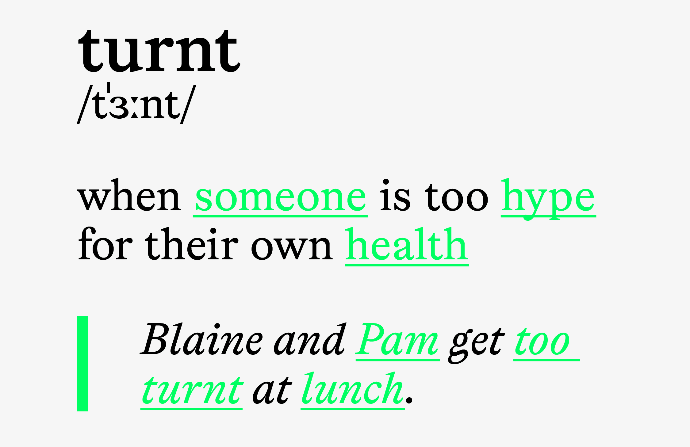
Imagine a library. Sealed-in quiet. Walls of books, thick as dictionaries. Many are dictionaries. But that’s not why you’re here. You sit before a big cube of a desktop computer. Navigate to your personal linguistic authority: Urban Dictionary. Feverishly type in the word that’s been on your mind since it left your crush’s lips in math class: turnt.
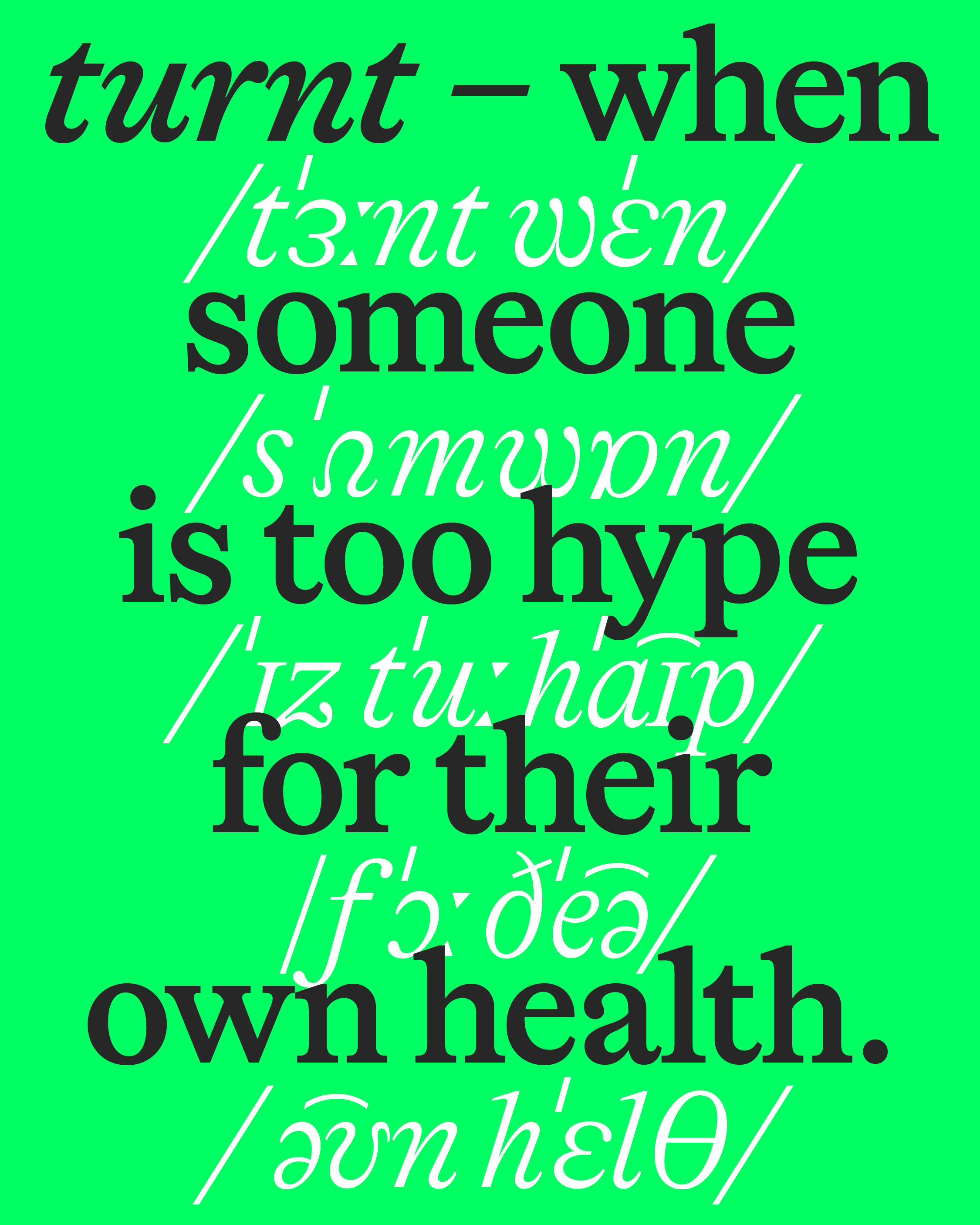
A thrill washes over you. Not just the definition — when someone’s too hype for their own health — but the sight of it: turnt, turned from spoken to serif. Dignified. Elevated. To see slang suited up, it feels almost subversive. And just right.
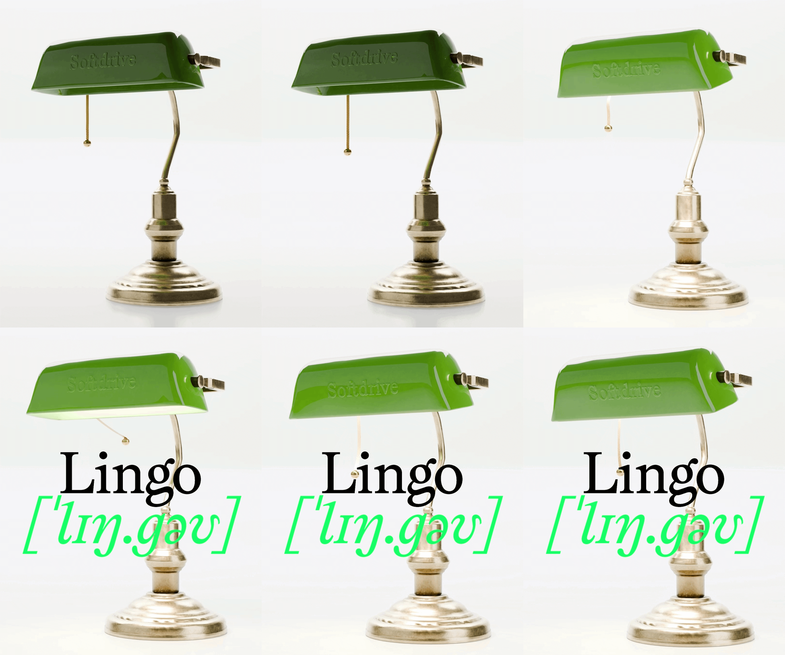
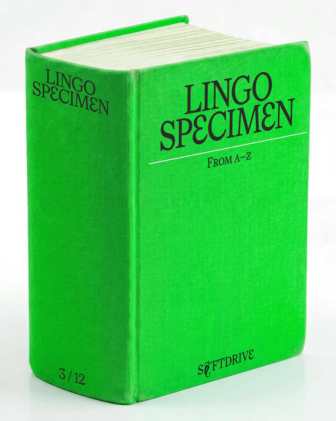
Softdrive’s new typeface, Lingo, was born from moments like this. Timeless elegance meets current trend. Intellectual authority meets the people’s slang. Lingo is both a workhorse — trotting along in body copy — and a show pony — shining in display.
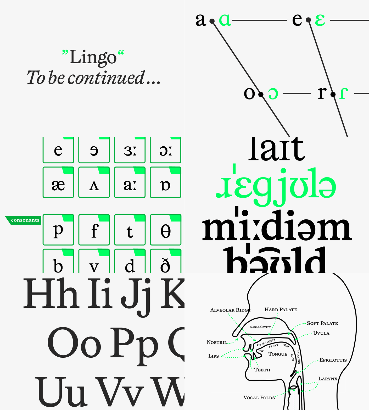
This serif respects classical typographic tradition... until it doesn’t. By including letterforms from the International Phonetic Alphabet, Lingo invites writers and designers to get funky.
Lingo hails from the 18th century and looks toward the future of language. And invites you to be part of shaping it.
Roman Bones
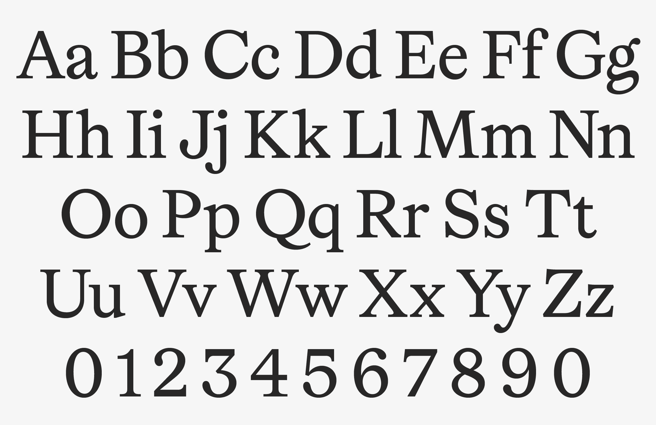
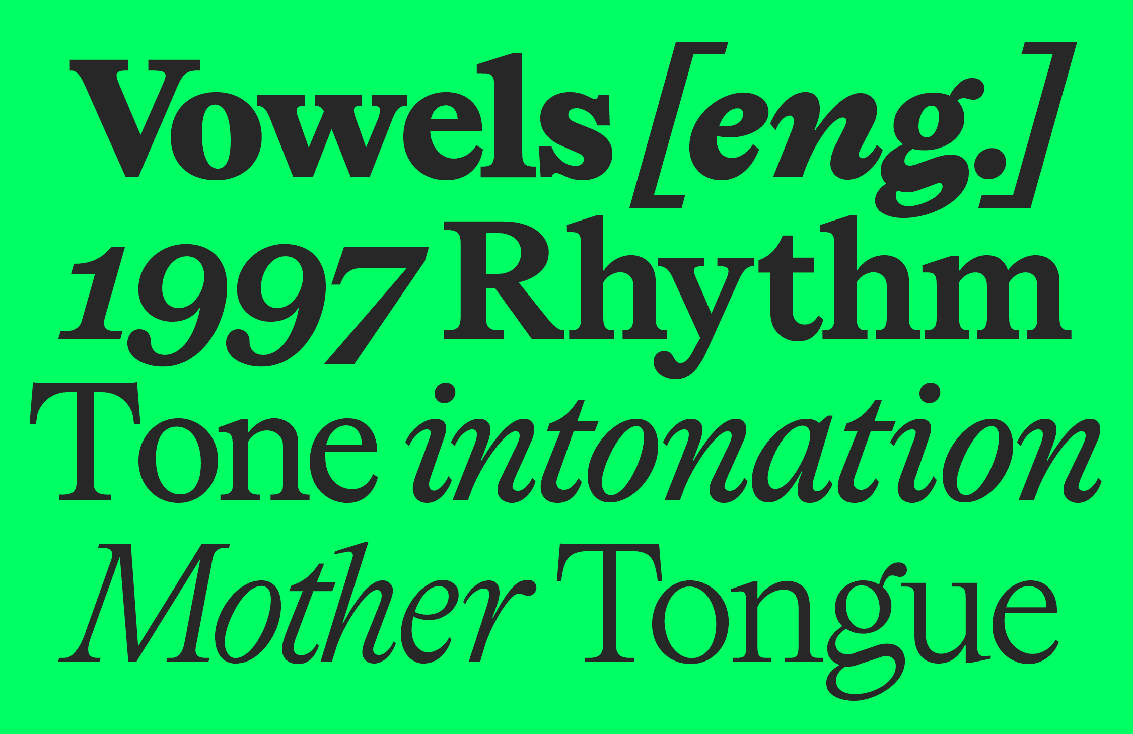
Lingo’s origins go way back to the 18th century. It’s inspired by the transitional roman typefaces of the United Kingdom and France — like the typefaces of William Caslon, John Baskerville (from around 1750), Philippe Grandjean, and Louis Simonneau’s Romain du Roi (1745). You know these fonts for their old-world elegance. That low stroke contrast. The warmth of letterpress printing. Lingo takes their iconic balance of geometry and charm and runs with it. The result is a serif specialized for long body copy that’s easy on the eyes.
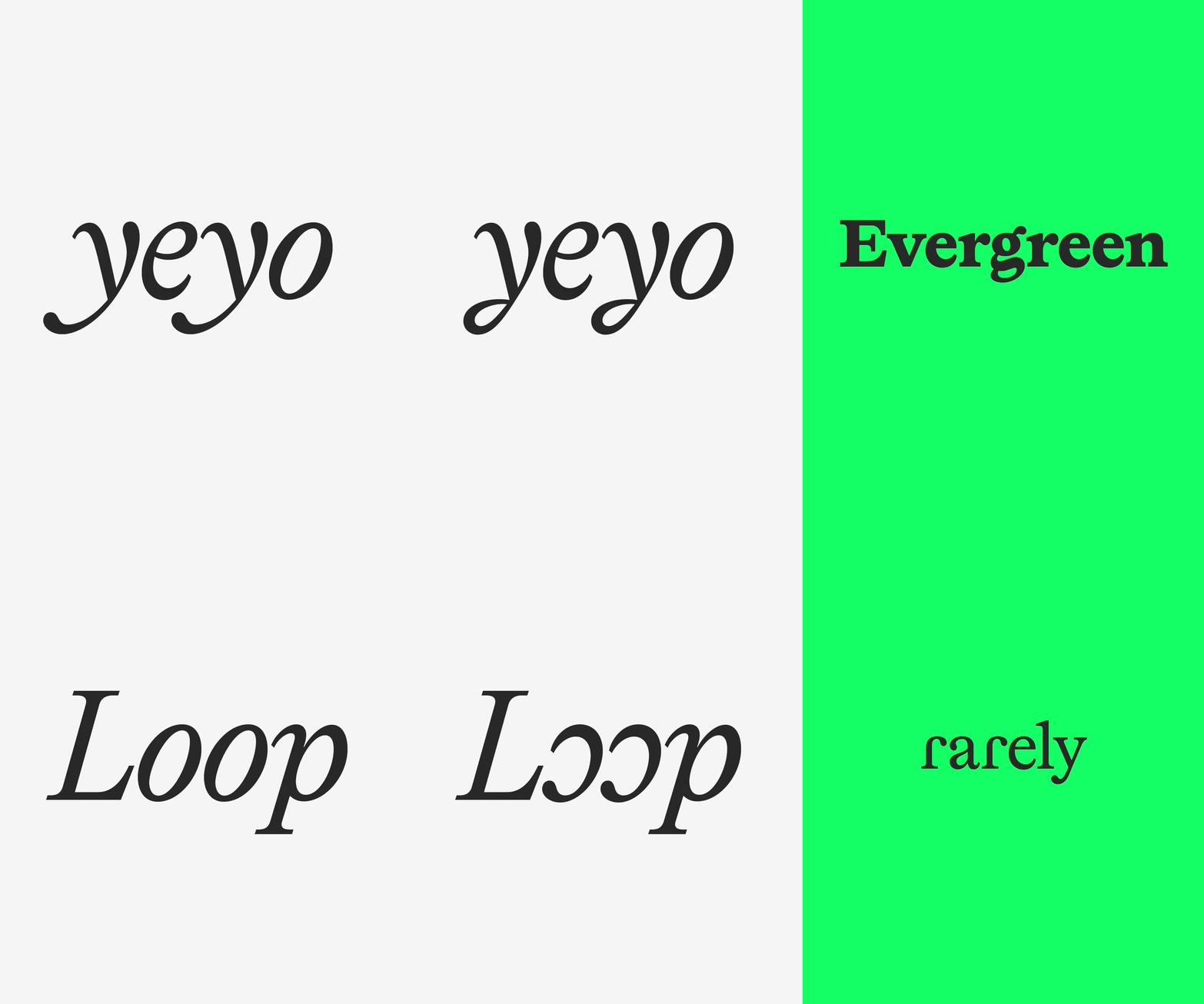
But Lingo is tradition with a twist. Check out that little g. The f and a. Those punchy drops give drama and personality. And when pure legibility is your goal, you can select for alternatives that dial back the drops.
Six Weights and True Italics
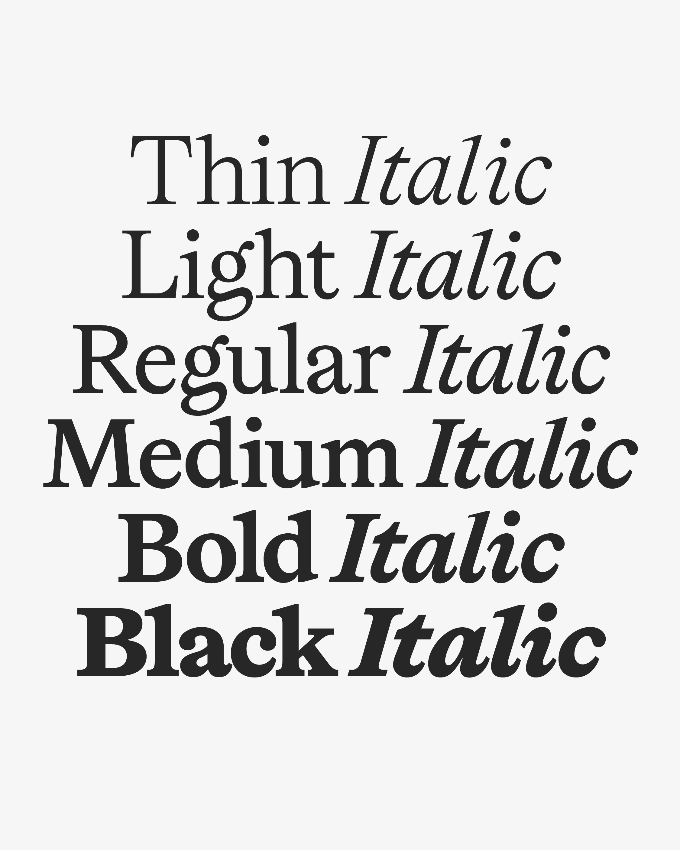
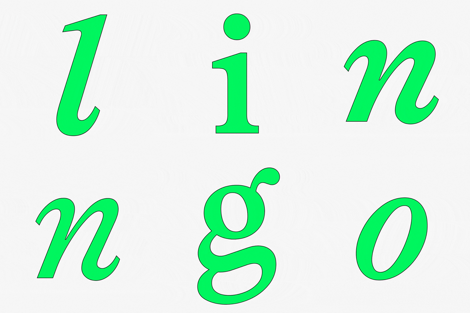
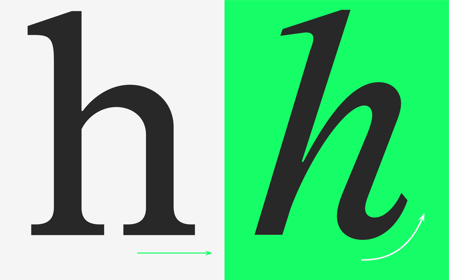
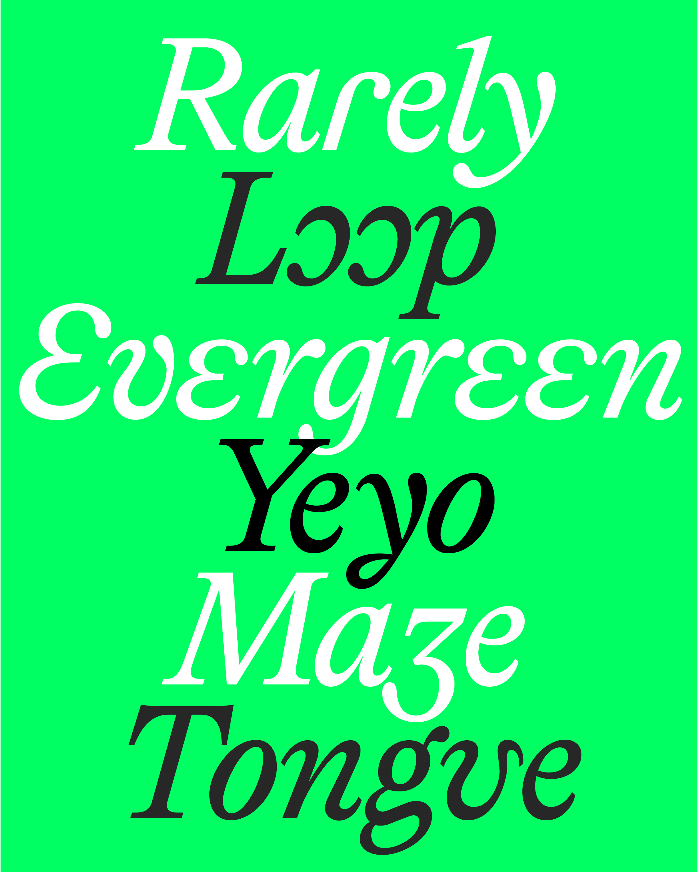
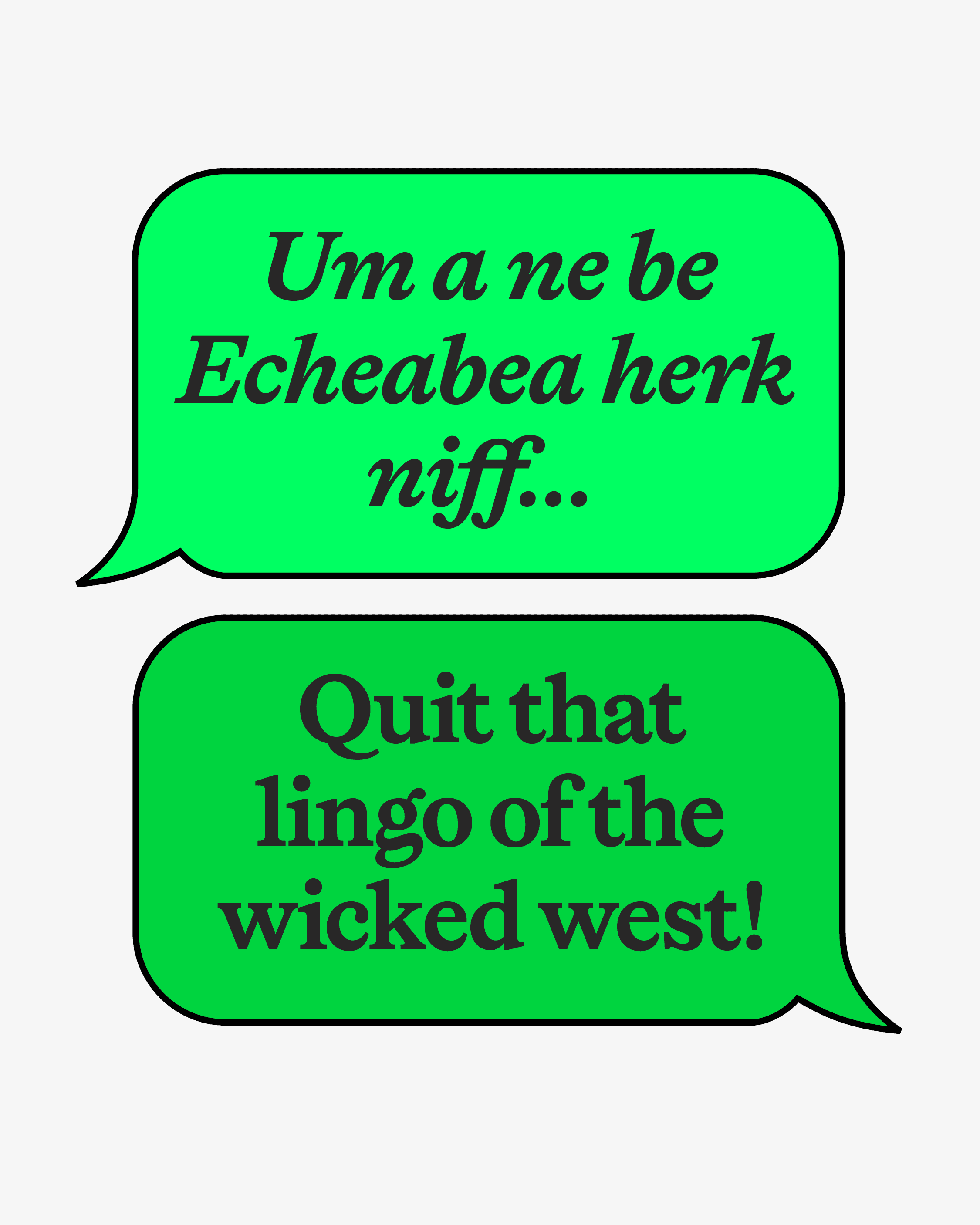
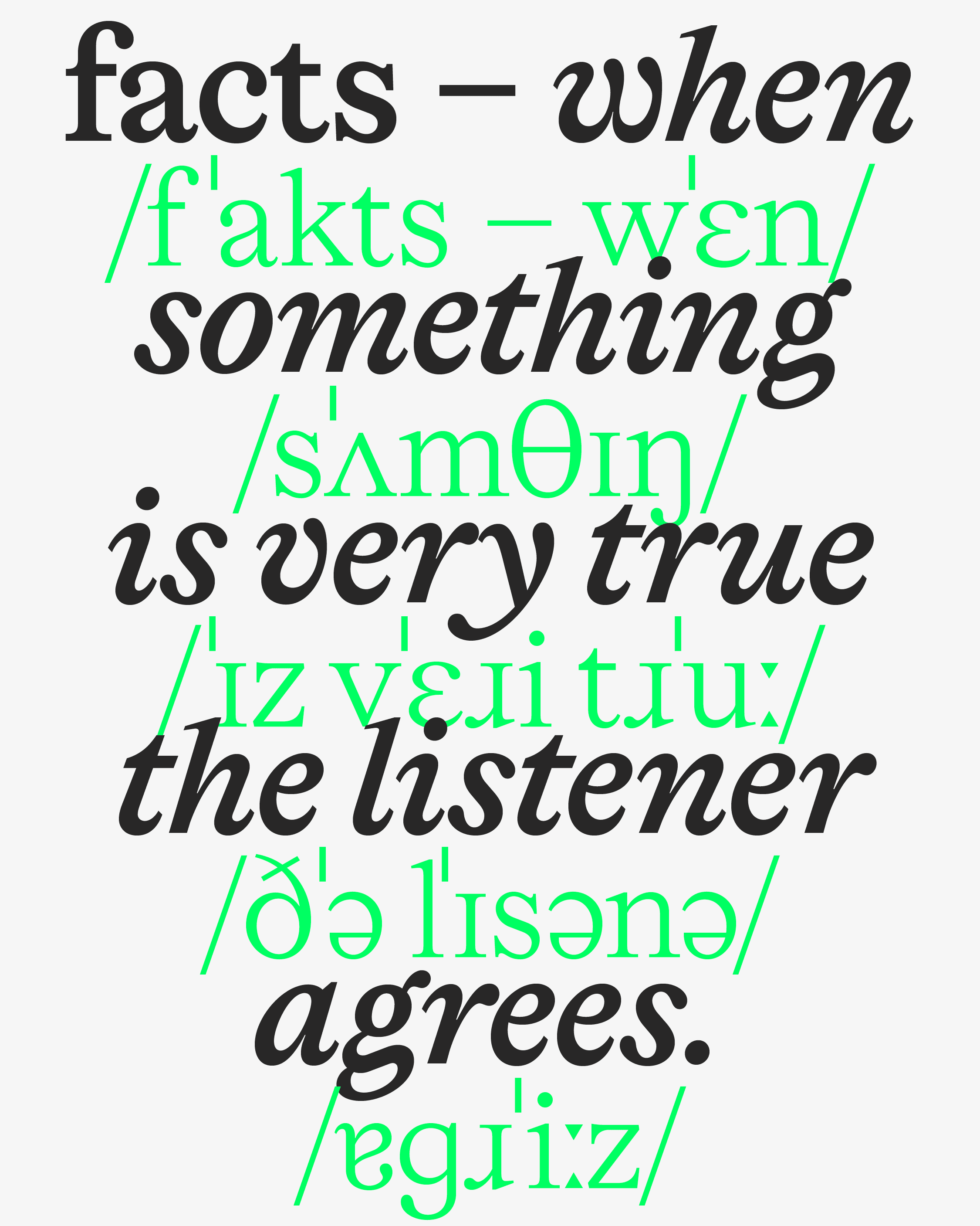
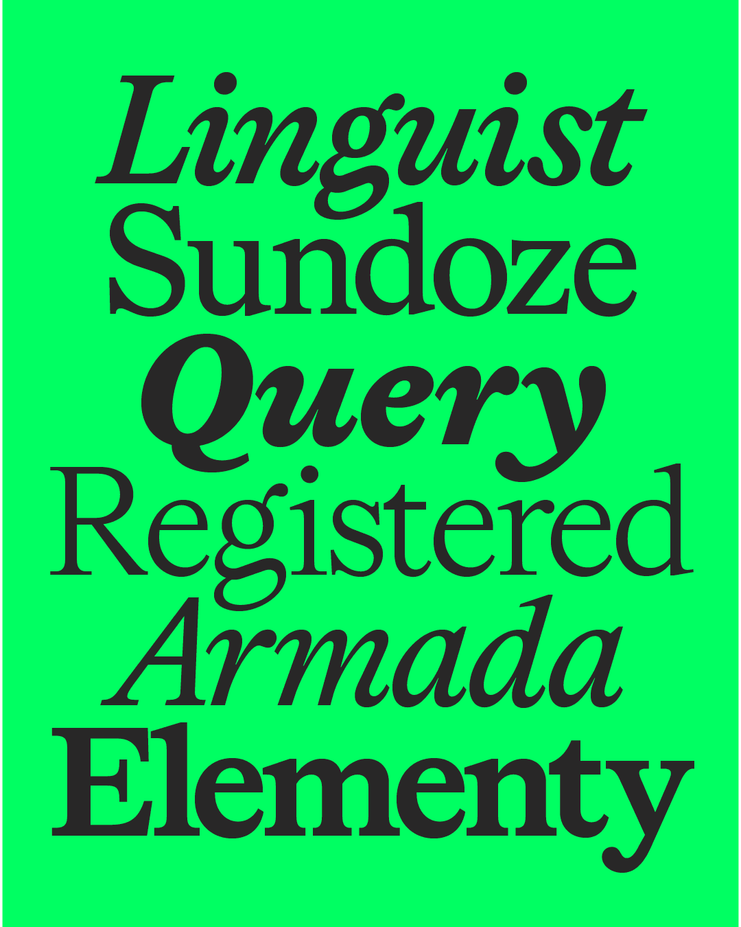
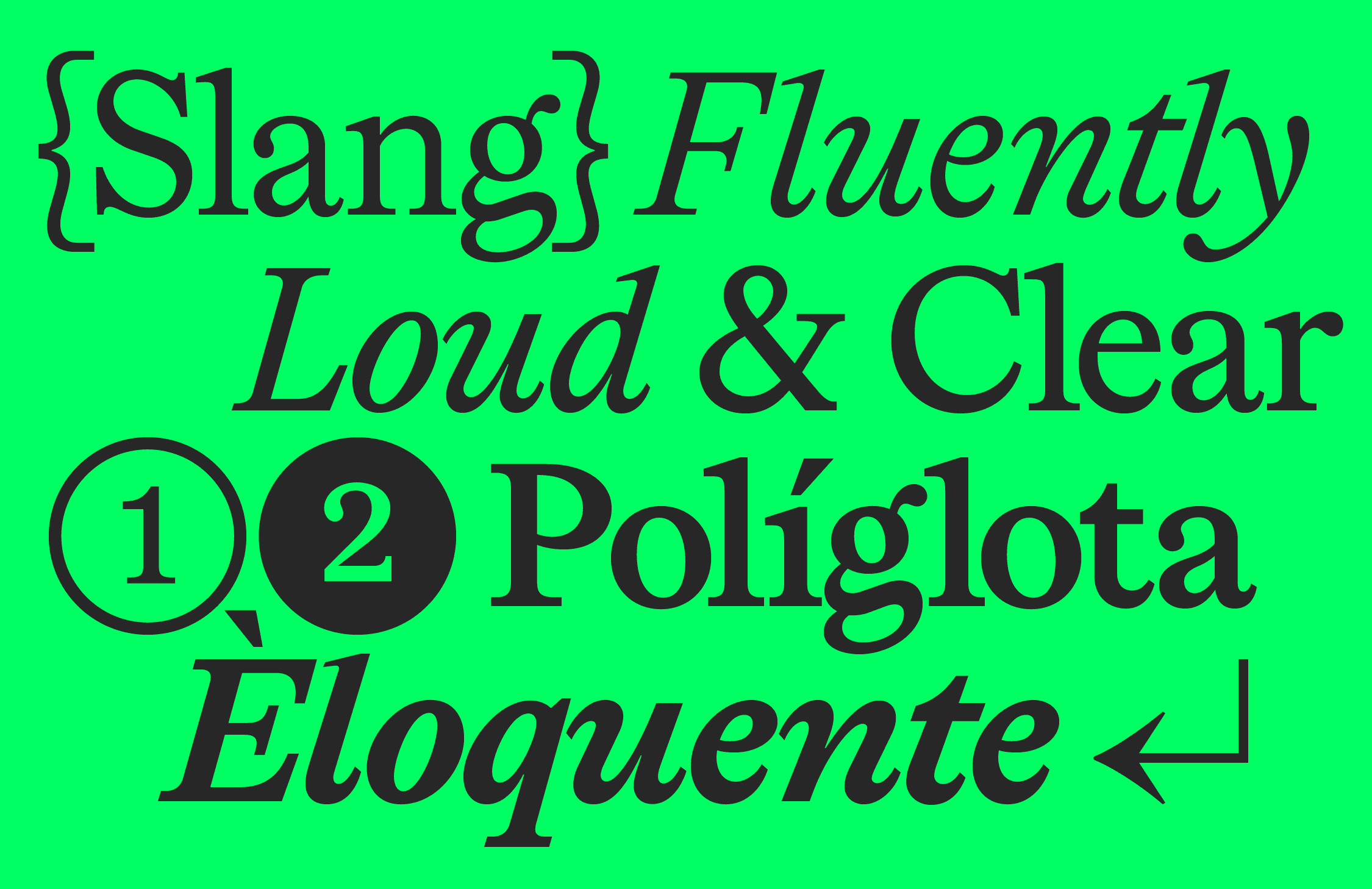
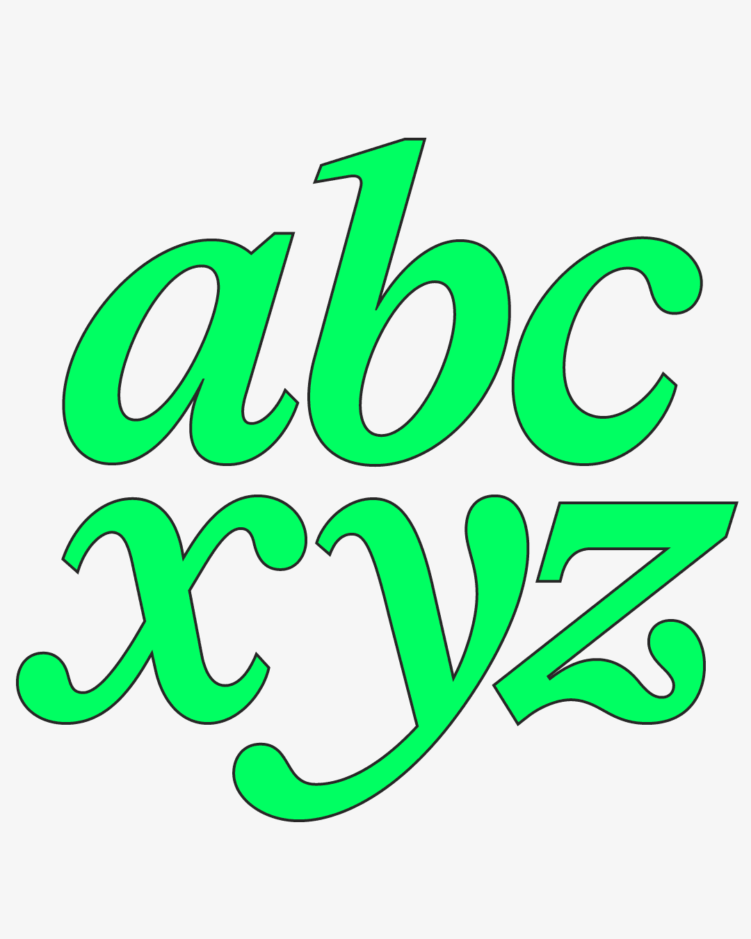
Like Lingo’s Roman ancestors, Lingo includes true italics — cursiva humanistica, rooted in handwriting. This gives them real presence that stands out in body text.
But we didn’t stop there. Lingo goes where typefaces have rarely gone before — italicizing even the IPA variants. All to give you the widest possible range of design possibilities. More on that below.
Let’s get Technical
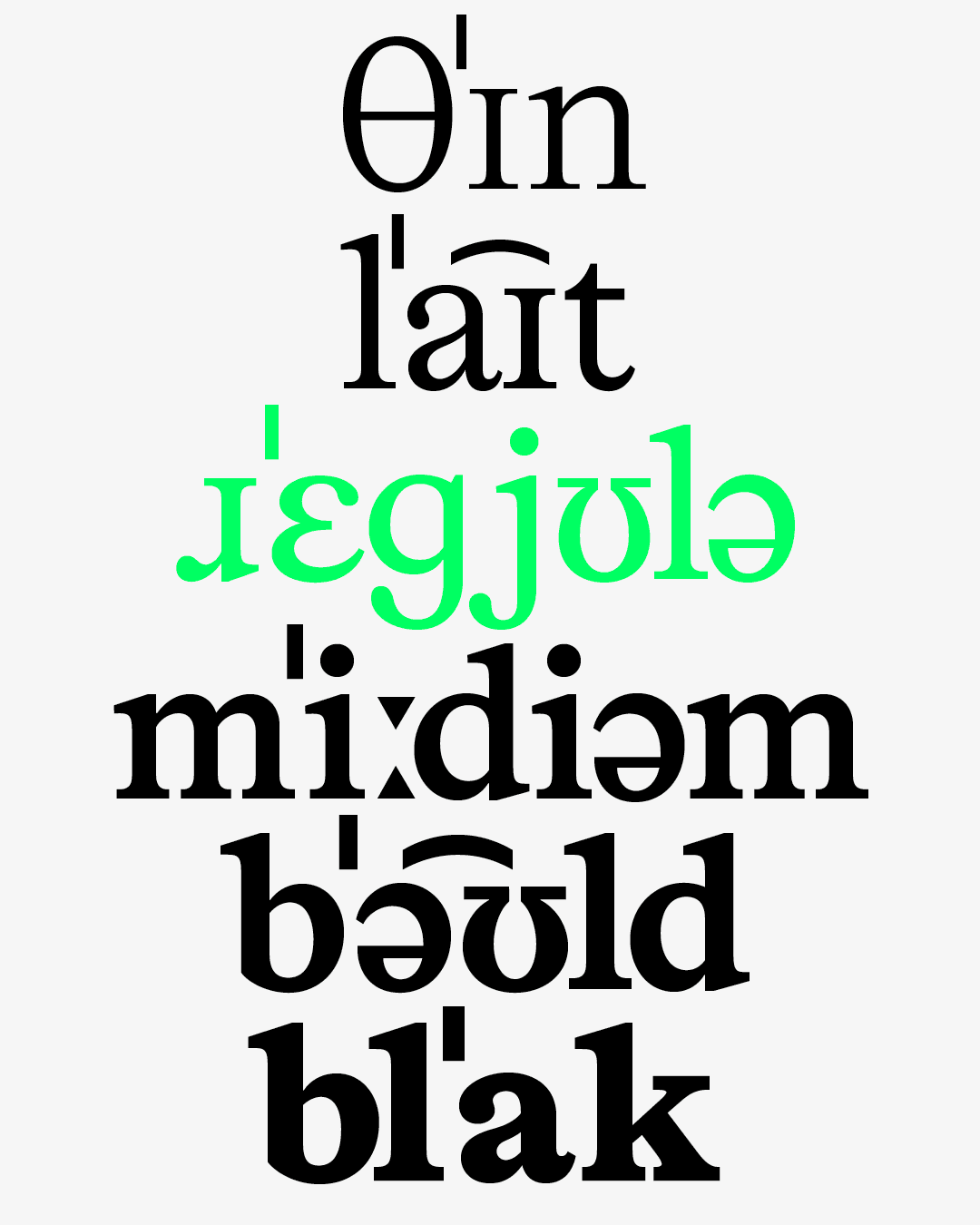
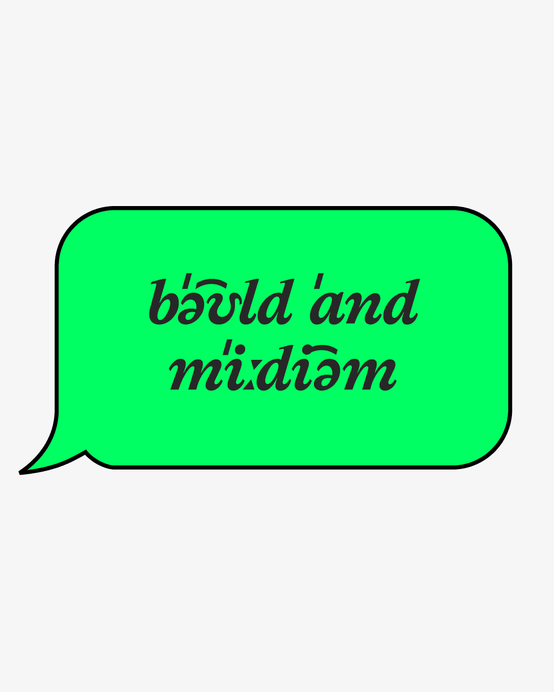
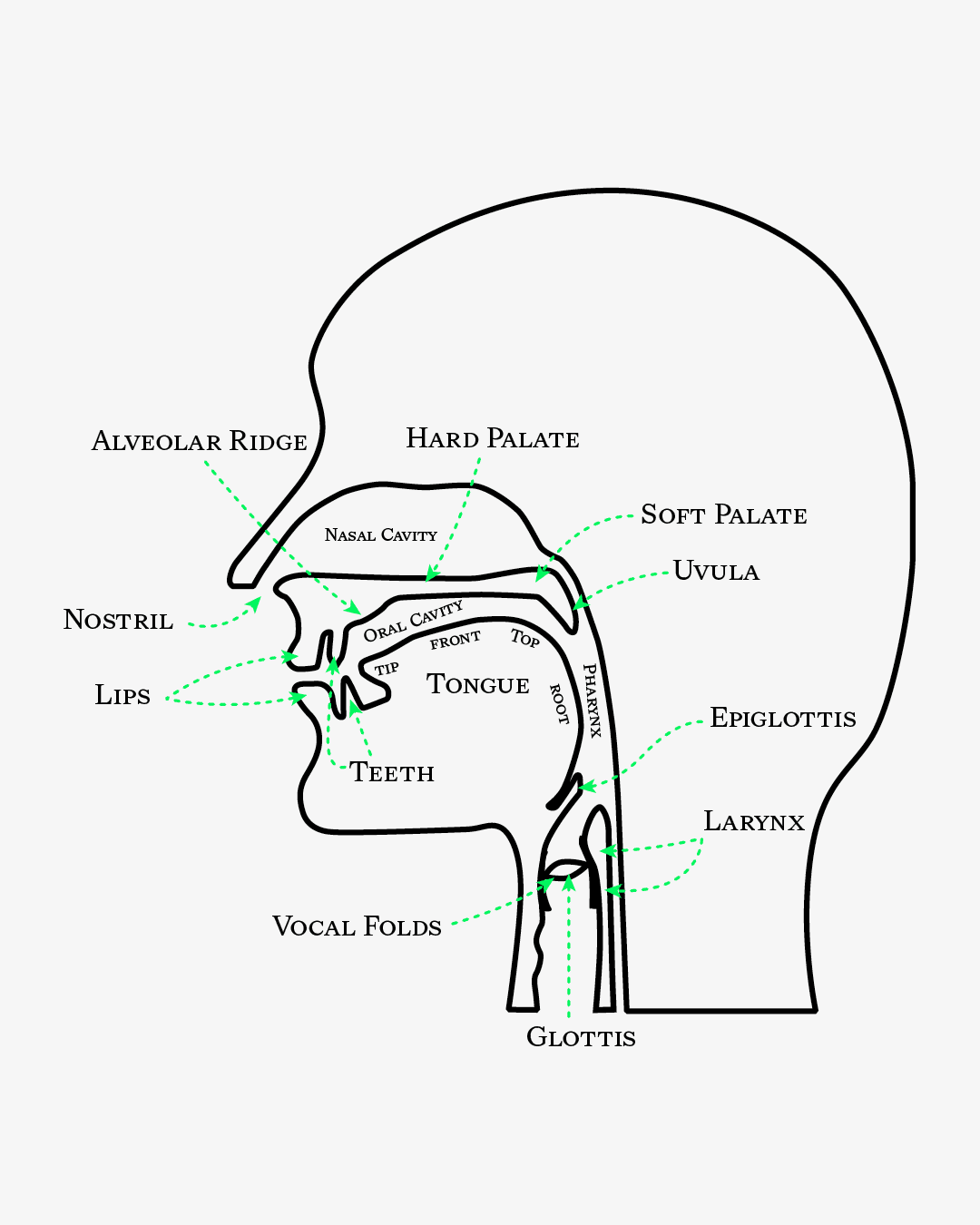
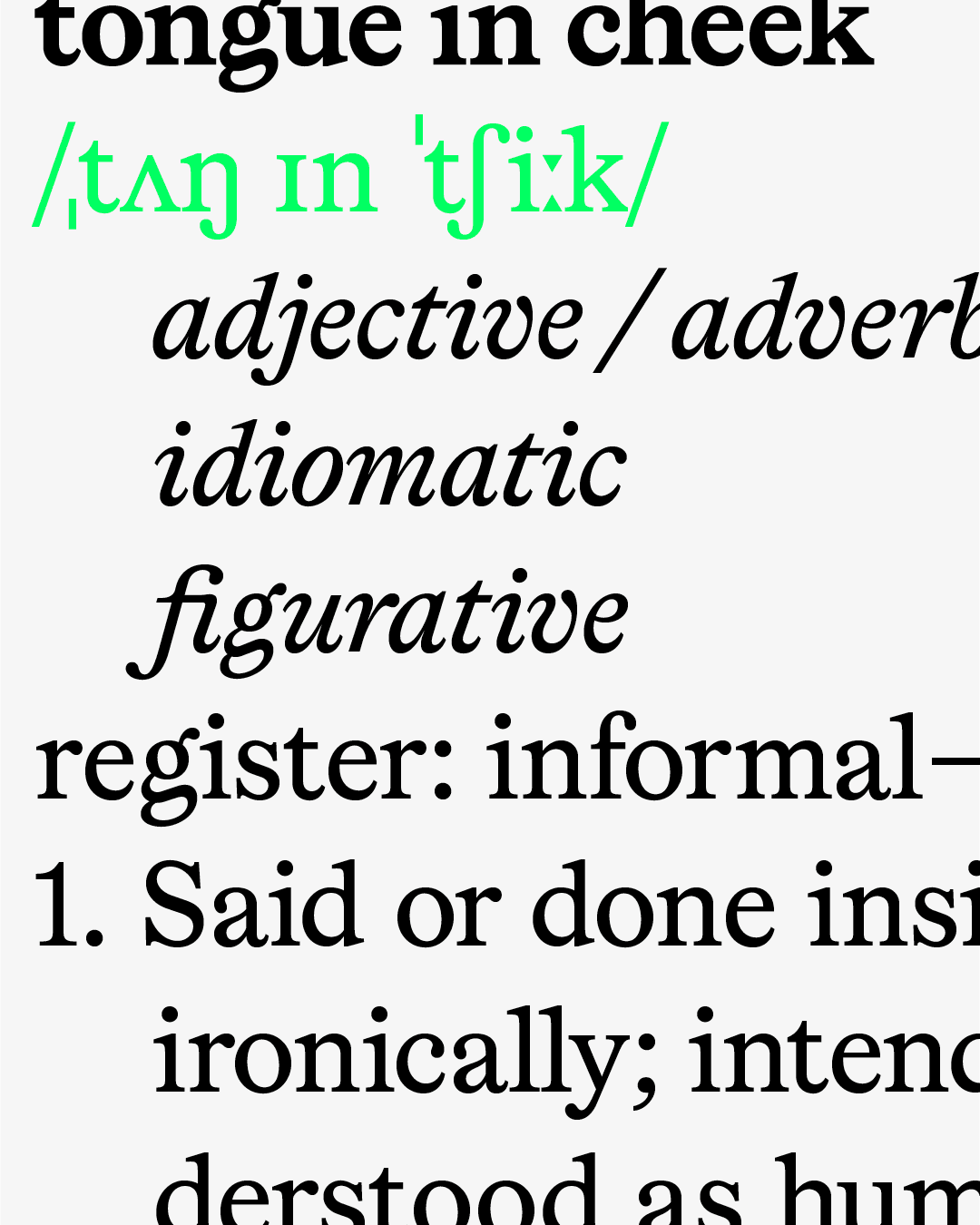
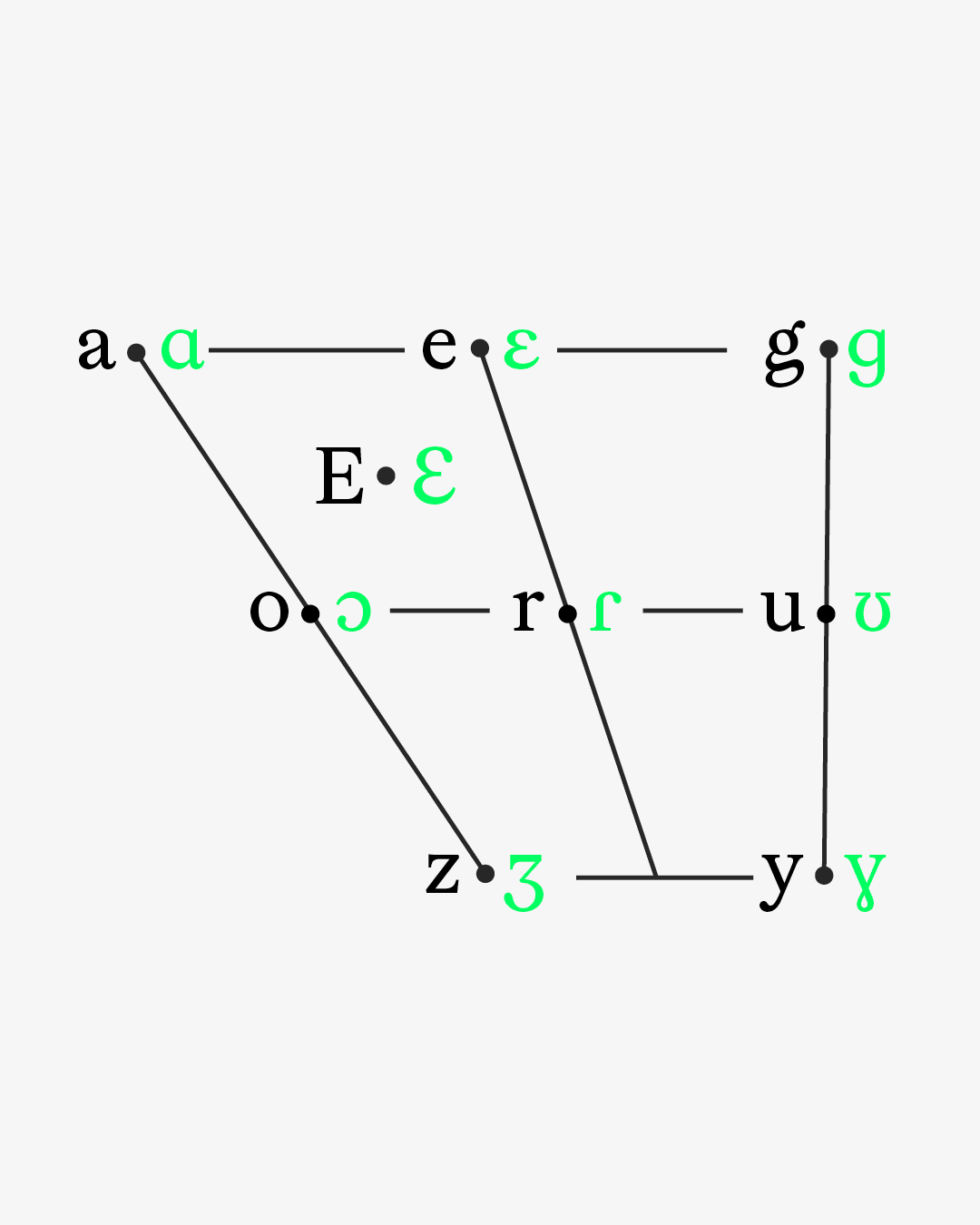
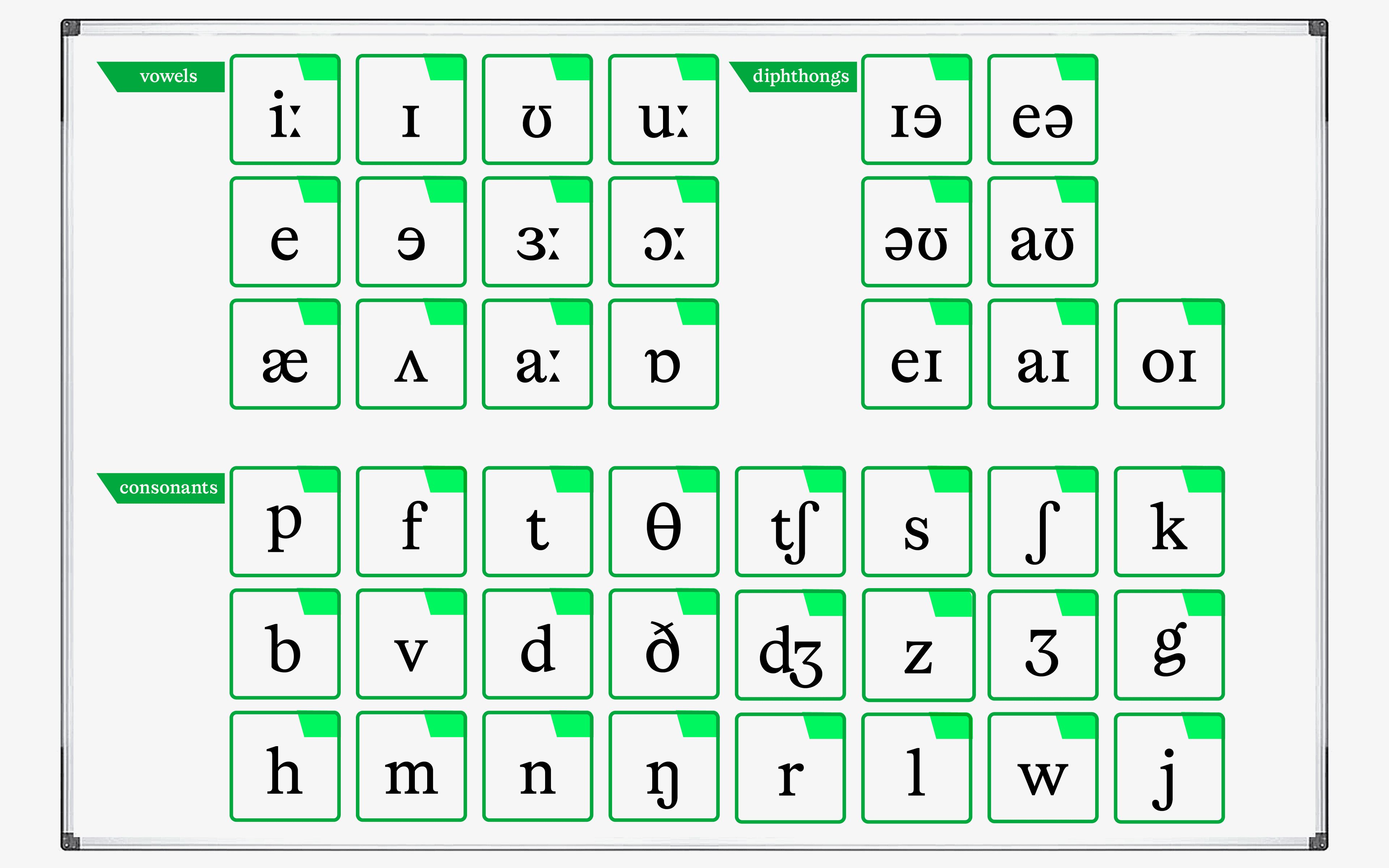
Here’s the technical rundown. We studied the phonetic characters most commonly used in Western languages. And included all of them. A typographic tongue twister, of sorts.
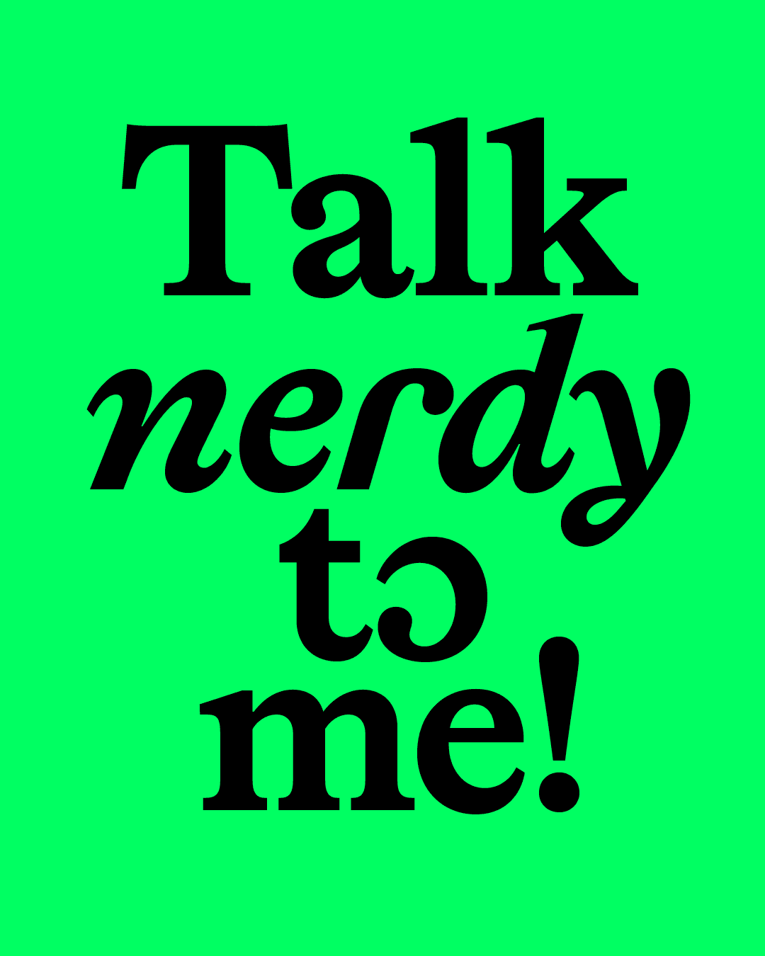
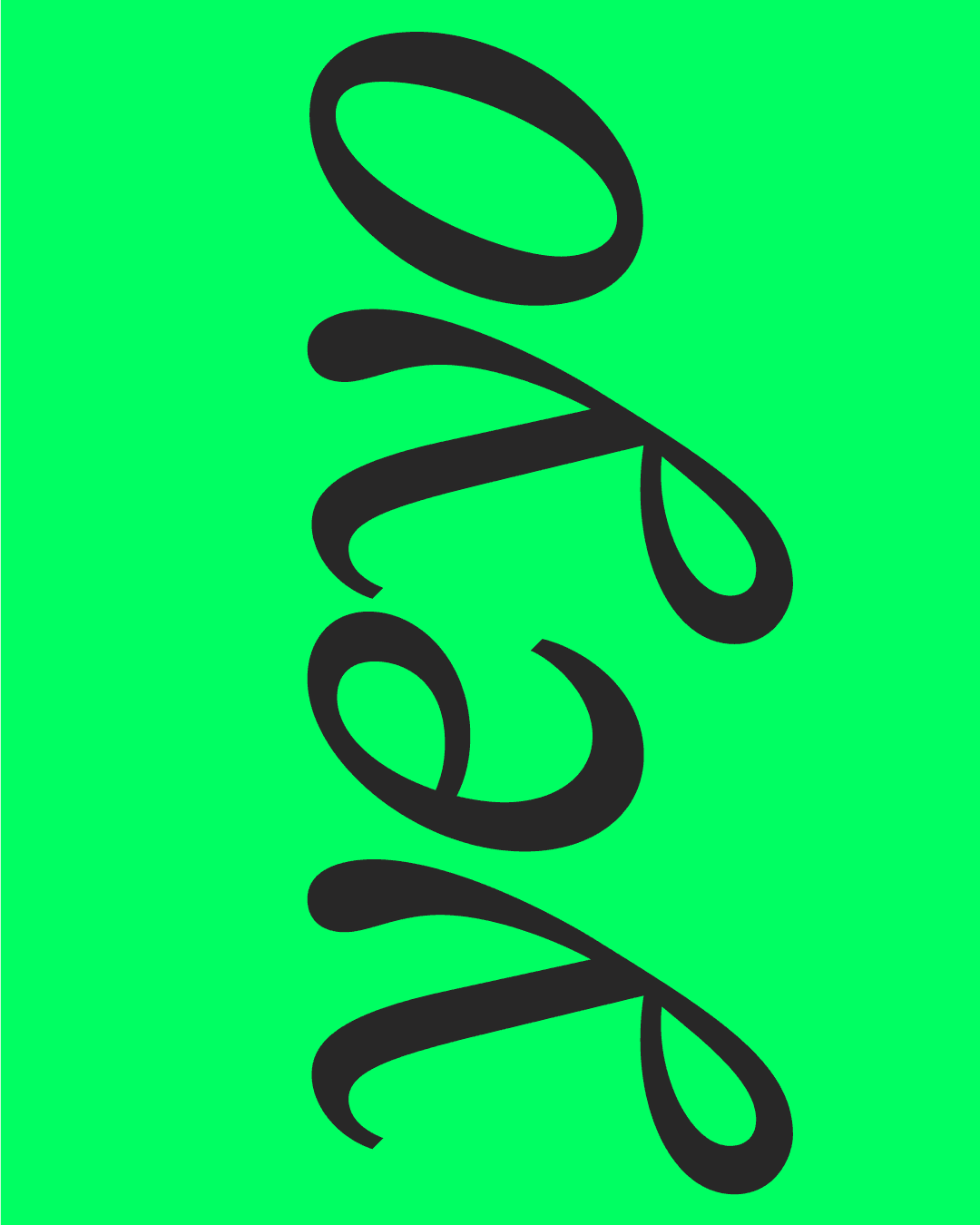
Because that wasn’t quite enough, we gave Lingo ten stylistic sets that swap classic for phonetic characters — built for distinctive display type and logo design. There are also further OpenType alternatives, including a special character for double g and a full smallcaps feature. Talk about characters with charisma!
The typeface and the complete trial set are now available on our website. If you previously downloaded the early trials, be sure to get the latest version now.
Thanks for reading
— Softdrive <3