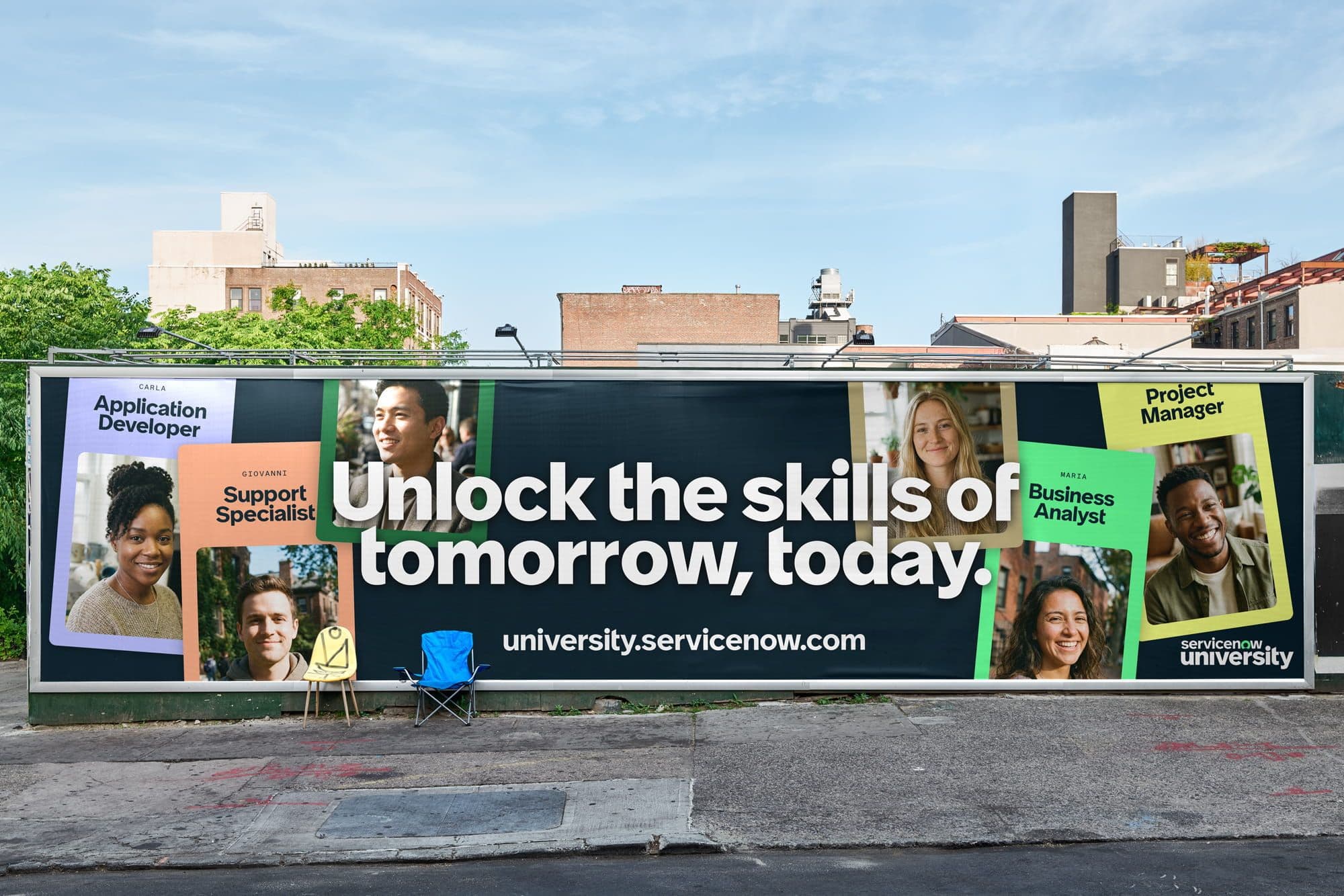
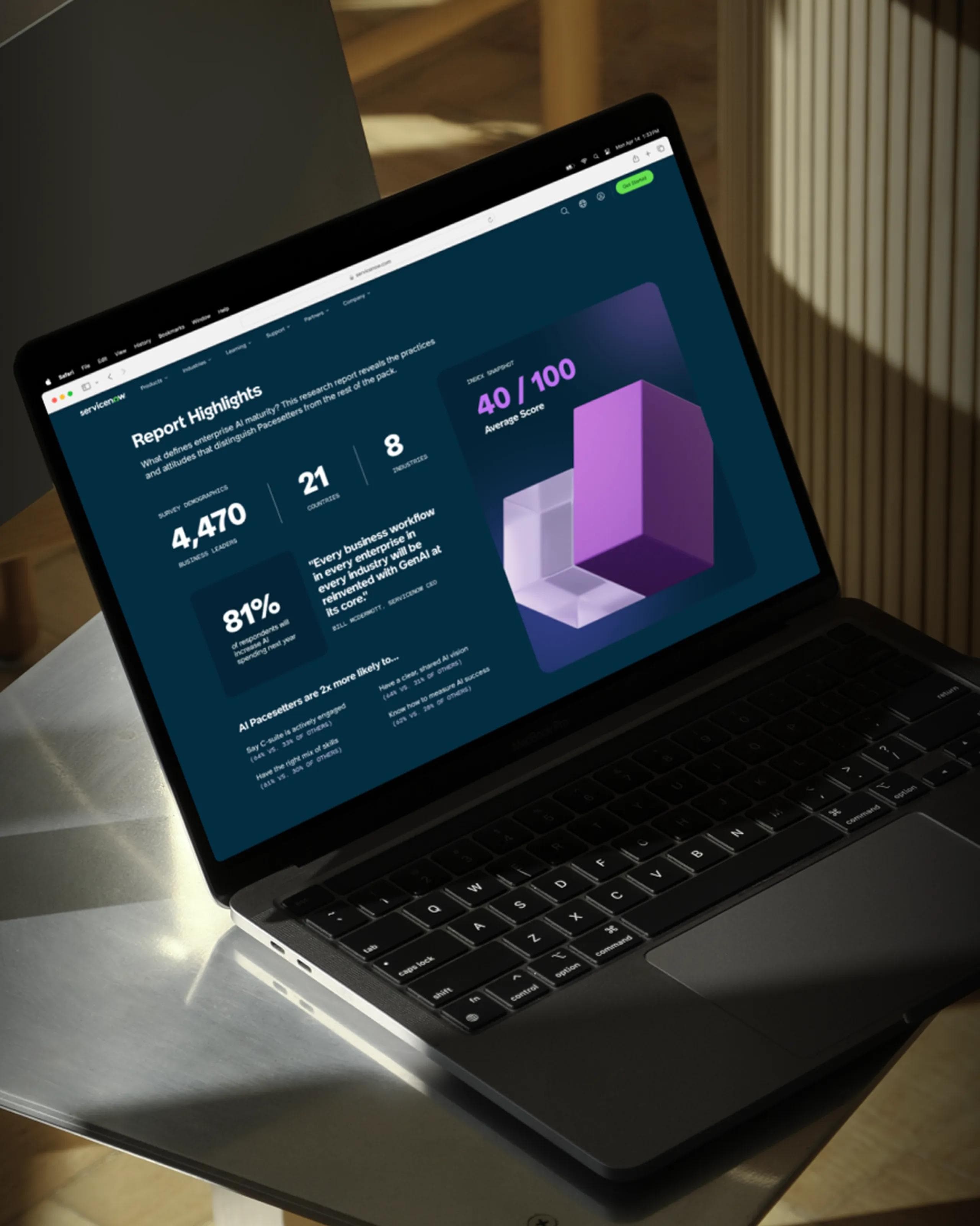
Softdrive was commissioned to design a custom typeface for ServiceNow, a major global tech company that helps businesses manage their digital workflows and IT operations. It was an exciting challenge—creating a typeface for a company of this scale means your work ends up everywhere, from apps and interfaces to marketing materials across the world.
We teamed up with Instrument, a creative agency based in Portland, who were redesigning ServiceNow's entire brand identity. Our job was to craft a typeface that would fit naturally into their new visual world while standing on its own. The type needed to feel both sharp and accessible—technical enough to work in software interfaces, but warm enough to feel human. After all, ServiceNow's tools are all about connecting systems and people, so the typography had to bridge that gap too.
For this project, we developed a custom typeface inspired by Protest Grotesk. The original family is a clean, geometric typeface with a subtle rough edge, giving it character and a slightly unconventional feel. For this project, however, we wanted to create something more approachable and human—something that would resonate with a human-centered corporate identity.
To achieve this, we softened select edges, refined proportions, and introduced subtle humanistic details throughout the design. The result is a font that feels friendly and accessible, without losing the distinctive personality that makes Protest Grotesk recognizable. This balance allows the typeface to maintain a modern, professional presence while connecting on a more personal, approachable level—aligned with the values of the brand it represents.
For a brand of this scale, a typeface needs to perform seamlessly across a wide range of applications. From advertising campaigns to digital interfaces, and even everyday correspondence, the font must work effortlessly for everyone—whether they are seasoned typographers or casual users.
To meet these diverse needs, we created two complementary versions: Text and Display. The Text version is optimized for legibility, efficiency, and versatility, making it ideal for long-form content, documents, and general-purpose use. The Display version, on the other hand, is crafted specifically for large-scale applications and advertising, designed to make a statement and bring punchy, marketable typographic compositions to life. Together, these versions ensure the brand communicates consistently and effectively across every touchpoint.
This brand-rebuilding project is far from over—we've just begun reinventing ServiceNow's visual identity. With this custom typeface, we've laid a foundation designed to grow and flex over time. The type system is built to be future-ready, able to stretch into new applications and contexts that haven't even been imagined yet.
Whether ServiceNow expands into different markets, launches new products, or transforms how they communicate with their audiences, the typeface can rise to meet those demands. It's not just a font—it's a living tool in their visual arsenal, built to remain relevant and effective for the long haul. As the company continues its trajectory, their typography will anchor every interaction with consistency and distinctive character.